
Find Your Audience Through Packaging
Your packaging is often the first interaction your customers will have with your product. Your goal is to create packaging that is aimed at your audience, but how do you get there? This guide will help!
The design of your packaging (color, shape, materials, etc.) is essential to helping you stand out at retail and outpace your competition.
Your packaging should make customers want to pick it up and learn more. It should contain key product benefits, high-resolution imagery, and more information about your brand.
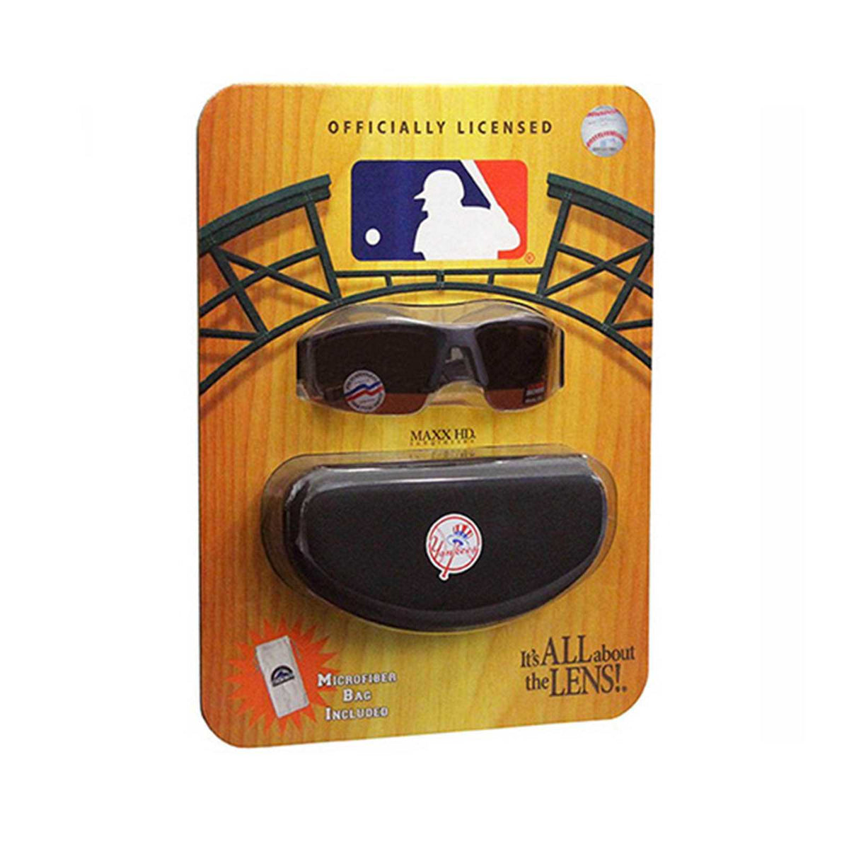
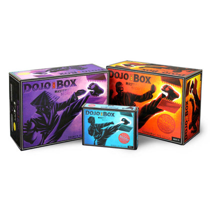
Retail packaging is a form of advertising on the shelf. It screams your branding, product benefits, and more - all calling out to customers.
Key Aspects Of Successful Packaging:
- Packaging is your first impression
- Must be visually appealing to your audience
- Cost-effective design
- It should reflect key aspects of your product
- Stands out against the competition
- Helps to form a customer relationship
Today, an infinite number of packaging options are available, and every option is completely customizable. This makes choosing the right option difficult.
Read on to learn more about defining your audience, choosing your shape, color, and more.
Table Of Contents
Tips To Create Packaging Aimed At Your Audience
Defining Your Audience
We will go into breaking down the key elements of your audience in a moment, but for now, think about your audience in a broad sense.
What is their job? Where do they live? What is their income level? Are they married or single?
Some professions and people may prefer simpler designs, while others want something with some actual design chops.
No two demographics are the same, so your packaging should focus on finding the right niche in order to sell more products.
Structure + Shape
Choosing the structure and shape of your packaging design is one of the most important aspects. Finding something that stands out but reinforces your brand and product can be tricky.
Structure
Your product may benefit from a sturdy box design like Apple's or an easy-to-open, easy-to-dispose approach.
Choosing the structure will help decide what materials to use.
Shape
Packaging shape is also critical for market success. Should you choose something bold in appearance? Or should you opt for a simple shape that is more stackable and efficient with shelf space?
Color
Bright colors will draw customers in. People are attracted to bright and vivid colors.
Choosing the right color will make your brand more exciting and high-energy, while other color choices will look sleek and sophisticated.
Your packaging color can make a bigger impact than some realize. Your color choice should be part of your entire branding and packaging strategy.
Color Psychology
It's been proven that customers react to colors differently. Therefore, the colors you choose for your product and packaging will reach different customers in different ways.
Think about your favorite brands - what colors do they choose?
Here are a few tips about color choices:
White
White conveys sophistication, simplicity, class, and purity. Apple used white for its presentation to create an air of high-end products that attracts those customers.
Black
Black is very similar to white when used correctly. This can create a product that screams sophistication and luxury. Black is typically used in combination with another color to create a specific color association in the customer’s mind.
Blue
Blue is one of the most used colors in marketing. It creates a feeling of a trustworthy brand, sometimes playful or even light-hearted, depending on the shade you choose. Dark shades lean towards sophistication; lighter shades may appeal to kids or feel “light” in customers' minds.
Red
Red is a color that can also be used differently depending on its shade. It can evoke romantic feelings, but it can also create an energizing or even aggressive look. One thing for sure is that it’s attention-grabbing.
Purple
Purple is all about royalty, velvet, and a posh experience. This can reinforce the idea that your product is for a higher class.
Green
Green is all about eco-friendliness, increased health standards, veganism, health, natural items, and even peace. Today, green is often used to refer to products that aim towards health and positivity through sustainable practices.
Yellow
Yellow can be bright and fun but also overwhelming because it stands out so much. Take a look at the candy aisle—there’s a lot of yellow! Yellow stands out, but it must be used effectively.
Define Your Brand Identity
Packaging is sometimes the very first interaction your customers have with your products. It is your chance to define your brand identity and make a statement about who you are and who you are selling to.
Harvard professor Gerald Zaltman claims that as much as 95 percent of purchasing decisions occur subconsciously.
Brand identity is all about clarity.
Key Questions
- What is my product?
- How is it different from similar products on the market?
- Who is my target customer?
- What is my company philosophy?
These answers will guide your design process to create something consistent with your brand identity goals.
This will help define your packaging materials, shape, color, and size.
Brand Storytelling
Your packaging is a great place to tell your brand story. Whether this is long-form information or an infographic approach with key bullet points, including “who you are” on your packaging is crucial to creating brand loyalty.
Take a look at Just Water’s approach to its physical bottle design.
Sometimes, the best approach is to tell a joke. Other times, a straightforward story is the right choice. Whatever fits your existing (or developing) brand identity is the one that’s right for you.
Digital Printing allows you to create multiple graphic designs, allowing you to target customers seasonally or regionally or create stand-out promotional runs.
Fonts
You may not think this is important, but your font choice matters! Choosing the right font is just as critical as the color.
It says a lot about your product.
Some fonts are more traditional, while others feel modern. However, you may be looking for a retro feel. Therefore, think about what your product needs.
Does a handwritten or script font feel more luxurious or childish in your category?
Product Description
The copy on your packaging needs to be compelling. Key elements should be huge and attention-grabbing, and when they’re drawn in for additional information, use a smaller font.
This sizing approach engages the customer at each phase of product consideration and warms them up for a purchase.
Your product description and benefits must be straightforward and easy to understand. It wouldn’t be great if the customer wasn’t quite sure what your product does compared to a competitor's.
Form + Function
Form
The appeal of your design is crucial to success in the market. Using a bold new approach that still fits the category and tells the customer key information about your product will help you.
This is a personal preference. What best fits the brand and speaks to your target customer?
Function
The functional side of your packaging is just as important.
First, it must be functional for the customer. It should be simple to open and access your products inside. It also needs to be easy to dispose of—and perhaps eco-friendly!
Second, it needs to be functional for the retailer. It must also be easy to store, restock, and open. Many brands are opting for Shelf-Ready Packaging to meet these requirements.
Third, it should be functional for your supply chain. A proper packaging analysis can help you cut costs.
7 Ways To Target Your Customers
1. Their Values
Consider your customer. Their motivation and values: What draws them into making a purchase?
Your packaging should reflect the most significant elements of your customers’ values to catch their attention.
Are they socially conscious? Or are they looking for a luxury good?
Every choice you make will depend on your customer persona.
2. Their Habits
How does your customer like to shop? Online or in-store? Are they looking for the latest cool gadget, or are they the customer who researches the best option?
Some customers love to look up unboxing videos; in fact, over 90,000 searches for them happen every month.
Other customers are looking for dependable and durable, and the packaging needs to reflect those core elements.
While millennials are typically looking for small and minimal. They may be looking for eco-friendly packaging that calls out strides the company has taken.
3. Gender
This is one of the most significant elements that should go into your packaging design.
Some products will appeal more to specific genders, or if a particular gender purchases for the family, the packaging needs to appeal to that gender.
For example, 59% of wine drinkers are female in the US. Those women won’t likely respond to a more masculine or aggressive design. Depending on the age, they may want a traditional-looking design or a minimal and modern look.
If a woman is doing the shopping but buying something for her husband, a particular type of packaging look will reinforce the values she sees in her significant other.
4. Their Lifestyle
Now consider their lifestyle. Are you targeting families? Bachelors? Or young couples?
You may want a single-serving size approach or a package that is a single purchase for a family of six.
One group may prefer to purchase in bulk, preferring value-sized packaging at Costco, while another will want a smaller packaging design to keep a wider variety of products in their fridge.
5. Segmenting Demographics
One great way to utilize a packaging innovation like Digital Printing is to create a variety of packaging designs, instead of a one-size-fits-all approach.
With digital, you can target different demographics and create seasonal or promotional messaging. The sky’s the limit.
You can do this because Digital doesn’t need those costly printing plates. So you can create as many different graphical designs as you want, without the need to create multiple plates. You simply change the art file.
6. Regions + Locations
Do your research on which packaging works better in each region. One look and style may work better in the middle of the country, while a completely different look works best in the cities.
If you can create multiple options that speak to your customers, you can sell more products.
Think about sports events. When a certain sport is in season, why not create a promotional run that includes the sport in your graphics? This will reach consumers in ways that other packaging simply won’t.
7. Adapt To The Marketplace
The market will always be changing, so you must pay attention. As new competitors emerge, or the dominant product in each category refreshes their brand, you will need to adapt.
A demographic's preferences may change when a new service is introduced. Gone are the days of DVDs and carriers; now, everything is streaming.
If your product can sell better during certain seasons, create packaging that fits around that. Create a new graphic run that speaks to the audience during the seasons.
6 Packaging Questions
Here are some of the most important things to consider when designing packaging.
1. Package Materials
What materials will best protect your products? What fits in with your brand? What are the opportunities to reduce your carbon footprint? (Customers today are very concerned about this.)
2. Package Construction
Will you choose flexible or rigid support for your product? How fragile is your product? Which option reduces material costs? How much space do you need for brand messaging? Will it stand or hang at retail?
3. Secondary Packaging
Will the size and shape of my packaging design prevent a simple secondary packaging option from shipping to retailers? This is an important step, and a proper packaging analysis can solve it.
4. Storage and Distribution
What is the cost of the secondary packaging and its transportation? How long will your product need to be stored before going on display? Will it be protected during this time?
5. Product Shelf Life
How long does your product last on the shelf before a purchase?
Consider the expiration date and your supply chain process.
6. Market Competition
Do a competitive analysis to determine what characteristics will fit into the category but stand out on the shelf.
The colors you choose, the size of the packaging, and even the shape are all opportunities to make a bold choice.
Inside The Packaging
The outside of the packaging is one thing, but now you need to consider the inside. What materials do you use to protect your products, and what does your customer have to get through to open it.
How your product leaves the packaging should also be a priority of the design.
Here are a few things to consider:
- What elements are involved with your product? (manuals, cords, accessories)
- How will your customer dispose of the packaging?
- Can you remove packaging to save on costs?
- How many products will your customer be using at once?
- What are the standardized units of your product?
- Will your product be stored in its packaging?
- Is the packaging “worth keeping” and possibly reusing?
Material + Production Costs
Costs can add up quickly. You should be considering alternative options as you finalize your design to ensure your packaging is functional, and cost-effective.
Materials
Choosing the right materials is critical for your packaging to be successful. You should always strive to select the most eco-friendly option and reduce your materials as much as possible.
The reason is that it will save you money in the short and long term.
Here are a few material resources to checkout:
- The Greener Package
- National Glass Association
- Flexible Packaging Association
- Plastics Industry Association
- The Aluminum Association
Printing + Production
When designing your packaging, be sure to get rough estimates of the printing and production costs for your design.
Part of the decision-making process is also choosing the most cost-effective options.
Labor
If your packaging needs to be assembled, glued, or have labor interact with it in some way, you need to know the costs and the production time associated with it.
Finding a company that offers Co-Packing can help you find ways to cut costs.
Is This The Best Design?
Everything we’ve discussed should have helped you create some goals for your packaging, but there are some key specifics to consider if you need to rethink your design.
What should your packaging accomplish?
Here are 4 questions to review:
1. User-Friendly
This should be a primary concern that you run every design option through.
How easy is it to open? Is it a simple process?
Some packaging may need to be stronger or use a premium board option, but you should still consider a simple, easy-to-open design.
Does your product need an easy-to-open lid? Is it in a pouch? Are you zip-tying the product to the packaging to prevent theft?
2. Standing Out
Another chief concern, standing out. The market has never been more competitive, with more products and services fighting for customer attention than ever before.
What choices have you made that make you stand out?
If you blend in on the shelf, you’re not going to meet your sales goals.
3. Innovative Technology
Every year, there are new advancements in technology to help design innovative new packaging that catches customers’ attention.
You should research the latest options available to you and compare them to your competition. Sometimes, the best way to stand out is with better customer interaction and experience.
Other times, just having a more economical design choice and a simpler look is all you need.
4. Sustainability
Eco-friendly has never been bigger. Digital printing is one of the most effective ways to create more responsible packaging. The ink is better for the environment, and you reduce waste considerably!
A proper packaging analysis can help choose the right materials and cut material costs by 10-20%.
We worked with a customer, Sinomax USA, who reduced their carbon footprint and saved over 6,700 trees annually - all thanks to Digital Printing. They even designed and trademarked their own eco-friendly logo design.
Can I Improve My Packaging?
Your packaging is some of the most valuable real estate for you. It creates a mini-billboard for you at retail, and when you stack a number of products in a display, you create a full-size billboard effect at retail.
Think about your target audience and even conduct focus group testing. Watch how they interact with your packaging. What are the most significant issues?
Do not wait until the last minute to consider these improvements. You should constantly revisit your key questions and goals to ensure you’re moving in the right direction.
Bennett Designs Custom Packaging
Bennett is a premier packaging and retail displays manufacturing company striving to protect and promote our clients' products with customized corrugated solutions. When you work with us, you’re part of the family. We will partner with you every step of the way.
With our fully integrated design-to-delivery process, we can be the single supplier source. We are an award-winning manufacturer of virtually anything corrugate. We offer everything from plain brown shipping boxes to sophisticated, high-graphic printed point-of-purchase displays and everything in between.


