Designers and artists use colors every day to create retail displays that are visually appealing. Marketers can also apply color theory in marketing to attract more consumers for their products or services. But using color theory correctly is one of the most essential parts.
Start using a color palette more effectively.
There are associations with colors that marketers can use depending on the personality of their target audience. According to studies about what appeals to people, consumers respond better when certain colors are used.
It is important for marketers to understand these associations about color in order to influence consumer behavior.
Table Of Contents
Why Use Color Psychology?
Colors influence our moods and feelings. They can make us feel happy or sad, depending on what feelings we associate with a color. For marketers, it is important to use colors that will bring positive emotions if they want to achieve their sales and marketing goals.
Having a better understanding of the psychological effects of colors makes it easier for them to apply this knowledge in creating effective marketing campaigns that target specific consumer groups.

The Color Red
In marketing, the color red is associated with 'passion.' It is a very intense and energetic color that can draw attention from consumers. The color red also represents love and romance, which means it may be a great choice for branding products or services related to these themes.
On the other hand, the color red evokes negative connotations of danger and blood. You have to take these aspects of the color red into consideration before applying them in your marketing strategies.
The Color Yellow
The color yellow is usually associated with happiness and positivity due to its bright tone. It also stimulates hunger, which makes it perfect as a marketing tool for fast food chains or restaurants serving breakfast foods. If used in small amounts, the color yellow has a very refreshing feeling.
However, when it is overused in design, the color yellow can create feelings of frustration and anxiety. This association with the color yellow can be used positively by marketers for products that want to convey energy and happiness such as sports cars or power tools.
The Color Blue
People usually describe the color blue as cold but also tranquil and calming. It has a soothing effect on people because it represents trust and security. This is why most hospitals and financial institutions use blue in their logos.
You should take note, however, that this color may not appeal to certain consumer groups who prefer bright colors over softer ones. The most effective way to use blue in marketing strategies is for products aimed at soothing people, such as pharmaceuticals and spa services.
The Color Green
In color psychology , the color green represents growth. It is also a symbol of nature, which makes it perfect for companies that have products related to eco-friendly living or using renewable energy sources.
You should use this color carefully since it may convey a sense of jealousy and envy among certain age groups. When used in too much abundance, the color green will appear dull and lifeless, so you should only apply it in small amounts whenever possible.
The Color Orange
Orange evokes feelings of happiness and joy due to its bright tone. You can apply orange when creating marketing campaigns for products that you want associated with leisure time, such as vacation packages or cruise ships.
However, the color orange is related to risk-taking and impulsiveness, so you have to be careful when using it for your products.
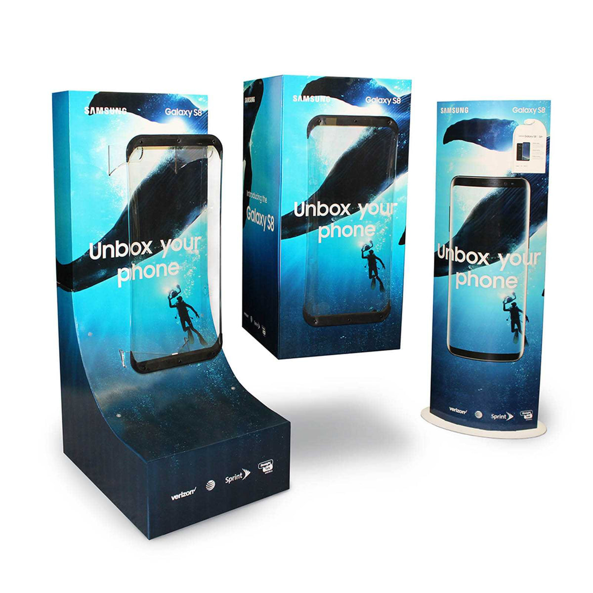
Pro Tip: Just using a POP can help increase sales! Be sure to design it with the right color.
The Color Purple
Purple represents royalty, which means it can be used by marketers of high-end products such as jewelry or luxury cars. However, it might not appeal to younger consumers since purple is associated with wealth and sophistication.
It could also be a good color for soothing skin care products or professional hair dyes.
Market Research on Color Psychology
Since people are often influenced by colors without them even knowing it, you will find market research about color psychology extremely useful when creating effective marketing campaigns.
It will help you better understand what associations different demographic groups make with certain colors and how you can use this knowledge to convey the image you want for your products.
It should be noted that color psychology is not an exact science, and it does depend on individual associations with colors. You also have to keep in mind that people are usually attracted to bright colors more when compared to pastel tones.
So marketers who are aiming for a youthful but sophisticated market will find bright colors like orange or red effective. While those looking for an older audience may opt for blue or green instead.
Regardless of the product, you can take advantage of the vast body of research about color psychology by using these tips when designing your marketing campaigns.
Regardless of the product, marketers can take advantage of the vast body of research about color psychology by using these tips when designing marketing campaigns.
Create A New POP Display Today!
Now that you know a little bit more about how color psychology can be used in marketing, why don't you try it out for yourself? Maybe your company is planning on launching a new product, and you want to make sure you are using the right colors.
Or maybe your company needs help creating materials to promote an upcoming event. Color is everywhere, so understanding its significance can make all the difference between an effective and ineffective marketing campaign.