
Creating A New Retail Display?
Appearances matter at retail and club stores, and that doesn’t just mean your product or packaging. If you choose a simplistic display, you’ll never make an impact on your business. You should always aim to create an award-winning retail display, so let’s get into some tips.
It’s essential to create the right display for your needs, and most importantly, provide customers with an in-store experience. The best displays create an impression for your brand that lasts with customers.
If your brand is struggling to design a retail display that performs well in-store, this blog may help.
Next are 12 expert tips for creating and executing award-winning retail displays that stand out in-store.
Table Of Contents
1. Define Your Goal
The first step in designing a retail display is to define your goals. Carefully constructing this overall goal for your display is key to your success. Otherwise, you’ll get lost in a spiral of possibilities.
Every design and logistical choice you make will revolve around this initial vision statement.
Are you introducing a new product into the market? Or are you creating a new niche? Are you simply looking to sell 200% more products than your current revenue?
Set your goals up front and you’ll be headed in the right direction.
2. Choosing Your Colors
Next, customers react to colors differently, so that means you need to choose your colors wisely. Your design must incorporate a feature that encourages customers to approach and interact with your products.
Start by choosing bold and bright colors and combinations that are extremely vivid.
- White: Sophistication, ease, class, innocence are expressed by White. To create an air of high-end goods that attracts such buyers, Apple made white a key element in its product design.
- Black: When used right, black is very similar to white. This can produce a commodity that cries for elegance and sophistication. Black is typically used to create a specific color association in the client's mind in conjunction with another color.
- Yellow: This can be seen as bright and enjoyable, but since it stands out so much, it can also be distracting. Look at the candy aisle, there's plenty of yellow here! Yellow stands out, but it must be used efficiently.
- Green: It’s all about environmentally sustainable, better quality of fitness, veganism, health, natural food, or even peace. Green is also used today to indicate goods that, through sustainable practices, strive for wellness and positivity.
- Blue: In marketing, blue is one of the most used colors. It creates a sense of a trustworthy brand, sometimes playful or even light-hearted, depending on the shade you choose. Dark shades tend towards sophistication, light shades, in the mind of the customers, may appeal to children or feel "light".
- Purple: It's all about royalty, silk, and a posh experience in purple. The belief that your commodity is for a higher class can be strengthened by this.
- Red: Finally, this is a color that, depending on the hue, may also be used differently. For romantic feelings, red can be used, but it can also produce an energizing or even violent look. For sure, one thing is that it's attention-catching.
3. Determine Your Product Quantity
Next, one of the most important steps is determining which display type is best for your campaign. The number of products you need to display will affect several factors.
First, the display size that you will need. If you’re looking to sell a large quantity of products, you may want a Pallet Display. Or if you only want to offer a handful of products, a smaller Floor Display might be the right option.
This will also impact the display's load capacity. More products mean sturdier materials and designs.
The other thing it will affect is your downtime at retail. How often will your display need to be restocked? The less time your display “looks empty,” the more time you can be selling.
4. Information Architecture
Now, consider the phases of the customer to inform the information architecture. You want to have large words that attract customers from a distance, and then smaller information that includes product benefits when they approach the display.
Keep your messaging simple. Five to seven words are best when describing the benefits of your product. Using bold, easy-to-read fonts is the best option.
Most customers today have knowledge about different products and categories before they head to the store, so you don’t want to waste space on information that they may already know. Find a way to target the specific information they need.
The last thing to consider is your target customer’s height. Where should you place the messaging so it strikes them at the right time!
5. Activate Their Senses
Next, your display should grab their attention. The best way to do that is to appeal to our five senses: Touch, smell, sound, taste, and, of course, sight.
Using a multi-sensory customer service approach would provide them with something they can't find in an online shop. Your show unexpectedly becomes something they need to engage with.
Whether you include additional items, such as lights or motion-activated features, creating a display that interacts with customers will lead to more sales, rather than being a passive experience.
Sometimes the best option is an additional cutout that displays the product in a close-up with high-resolution imagery. Choosing the right color combinations can put the customer in a certain mood when they see your product.
6. Reach Your Customer Emotionally
Now, how can you get your customer excited about your product in some way? The human face is typically the most attractive option for brands, as people are drawn to other people, but what else can you try?
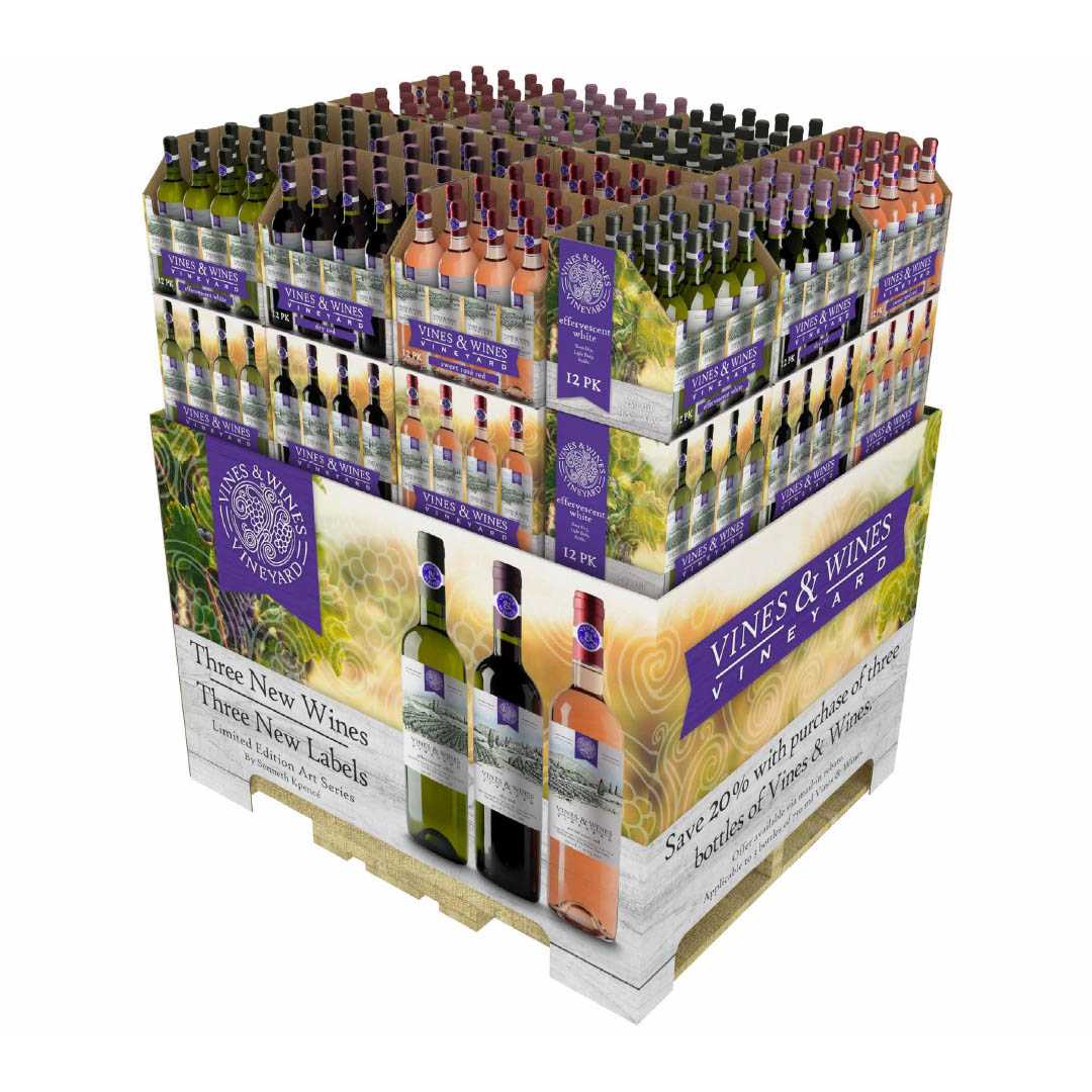
If it’s sports season, creating a sports-themed display will instantly attract those customers. Or if you are offering wine, creating the look of a vineyard or winery will make your products look that much more premium.
Understanding what motivates your target customers will help you determine the best design for your retail display.
7. Create A Branded Experience
Think about the whole campaign next. Some of the most exciting campaigns of the last decade have been created by taking an approach that includes the entire retail environment of the customer, and even extending it with a digital experience.
If you can create a presentation that connects to social media, whether the show picture is posted or the graphics are integrated into a promotional campaign, you can enhance exposure and increase revenue.
Providing customers with a comprehensive experience elevates your brand from ordinary to premium in their eyes. They're going to notice you and come back for more.
What is your brand’s best chance to create an experience?
8. Utilize Digital Printing
Creating a custom retail display and bringing it to market is now more affordable than ever. Digital Printing gives you the flexibility to quickly prototype, adjust your messaging, and change with the marketplace.
First, let’s talk about designs. Many brands adopt a one-size-fits-all approach to their retail displays, mainly because they rely on traditional methods.
Imagine creating a single dieline, but multiple graphic options. More displays + more products = more sales. By refreshing your retail look every few months, you’ll sell more products.
Next, compare the tooling costs. When you want to create a retail display, other printing methods require several weeks of lead time and upfront costs to make printing plates. That means you need a bigger upfront budget before you get your first display.
These are one-time costs, and can discourage many brands from creating alternate designs. Imagine if you didn’t need to factor those into your budget? Where else could that money go?
9. Study The Retail Environment
It is extremely essential to consider the store's foot traffic flow. You increase the odds of reaching your client by placing your display in the right area.
Does your item pair well with the electronic section's printers? Or does your item need to be close to the food for the baby? At the right time, hitting your customer can make or break your sales.
Or you might be running a digital campaign that they will see as soon as a hanging show enters the shop.
Whatever you pick, as a potential customer, go through the store and decide the best choice for your next show.
10. Ensure Retail Compliance
Next is a step that can become a huge roadblock if you’re working with the wrong team. You want to ensure you’re starting with designs that are already retailer-compliant, so you don’t waste any time.
Here are 5 other considerations:
- Lock in the retailer’s requirements, including style guides, visual merchandising standards, rules for type usage, changing store formats, and display authorization procedures.
- Design your display for the allotted floor space.
- If assembly is required, the typical timeframe is 5-10 minutes; anything over will likely need a redesign. Be sure to include detailed planograms for proper assembly.
- Failure to deliver on time can cost a retailer and a brand thousands of lost dollars in potential sales.
- Make sure your displays have a restocking plan in place to minimize downtime.
11. Create A Supply Chain Plan
Once you finalize everything, your retail display is ready for full production. You can sit back, relax, and wait for the arrival of your display! Receiving your shipment depends on your requested timeline, the size of the display, the method of delivery, and other factors.
It varies depending on your situation, but your account manager will keep you informed about the production and shipping process, ensuring you stay on track.
Key Questions:
- Will your Display be shipped fully assembled or KDF?
- What is the weight of your Display with your Shipping Box and Supplies?
- Where will you store your Display?
- What is the cost for Packaging Supplies?
- Fulfillment costs, if any?
- How will you account for returns?
Pro Tip: If you need to order on a consistent basis, speak to your product specialist to map out your inventory expectations and schedule. This will make it easier to maintain a healthy inventory flow and allow the manufacturer to know exactly when you need it.
12. Follow Up On Maintenance
One of the most important things you need to do is stay on top of maintenance.
Don’t neglect your display upkeep. Even the best displays will lose their appeal if they look dusty or worn down. Remember, your display represents your brand and your product - if you invest in a great display, you should make sure it stays presentable.
Displays should be checked regularly, even throughout the day. That way, you can be confident they never appear “shopworn”.
Bennett Creates Custom Retail Displays
Bennett is a premier packaging and retail displays manufacturing company striving to protect and promote our clients' products with customized corrugated solutions. When you work with us, you’re part of the family. We will partner with you every step of the way.
With our fully integrated design-to-delivery process, we can be the single-source supplier. We are an award-winning manufacturer of virtually anything corrugate. We offer everything from plain brown shipping boxes to sophisticated, high-graphic printed point-of-purchase displays, and everything in between.


