Color Theory Is Important For Packaging
Colors are used by designers and artists on a daily basis to generate aesthetically appealing creations. Color theory can also be used by marketers to attract more customers for their products or services.
Colors have associations that marketers might use depending on their target audience's personality. According to studies on what appeals to individuals, consumers respond better when particular hues are employed.
As a result, it is critical for marketers to understand these color associations in order to favorably affect consumer behavior.
Related: 6 Simple Strategies To Engage Customers With Packaging
Table Of Contents
Why Use Color Psychology In Packaging Design?
People's moods and feelings are influenced by colors. Depending on the emotions connected with each color, they can make customers happy or unhappy. It is critical for marketers to employ colors that elicit pleasant emotions in order to achieve their sales and marketing objectives.
It will be easier for them to employ this knowledge in building efficient marketing campaigns that target specific customer groups if they have a deeper understanding of the psychological effects of colors.
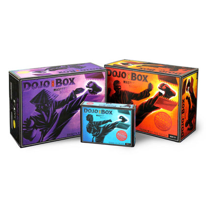
Red
The color red is associated with 'passion' in marketing. It's a vibrant and vivid color that might attract customers' attention. Red is also associated with love and romance, thus it could be an excellent choice for branding items or services relating to this theme.
The color red, on the other hand, conjures up images of danger and blood.
Before incorporating the color red into their marketing plans, marketers must examine these factors.
Yellow
Because of its vibrant tone, yellow is often associated with pleasure and cheerfulness. It also makes people hungry, making it ideal as a marketing tactic for fast food restaurants or restaurants that serve breakfast meals.
Yellow has a very invigorating effect when applied in modest amounts.
When utilized excessively in design, though, the color yellow can evoke sentiments of irritation and anxiety.
Marketers can exploit this relationship with the color yellow to their advantage when marketing products that express energy and happiness, such as sports cars or power tools.
Blue
The color blue is often described as chilly, but it can also be quiet and calming. Because it conveys trust and security, it has a calming impact on people. Blue is commonly used in hospital and financial institution logos for this reason.
Marketers should be aware, however, that this color may not appeal to some consumers who are more comfortable with bright colors than softer ones.
Blue is best used in marketing campaigns for products that try to calm people down, such as medications and spa services.
Green
Green is a color that indicates progress in color psychology. It's also a natural emblem, so it's ideal for companies that sell products that promote eco-friendly living or the use of renewable energy sources.
Marketers should be cautious when using this hue since it can evoke feelings of envy and jealously in specific age groups.
Because the color green can appear dreary and lifeless when used in excess, marketers should utilize it sparingly whenever possible.
Orange
Due to its vivid tone, orange elicits thoughts of happiness and excitement. Marketers might use orange in marketing efforts for things like vacation packages and cruise ships that they want to be linked with leisure time.
The color orange is associated with risk-taking and impulsiveness. So marketers must exercise caution when utilizing it to promote their products.
Purple
Purple is a royal color, thus it can be employed by marketers of high-end goods like jewelry or luxury automobiles. This color is linked with wealth and elegance, hence it may not appeal to younger customers.
This color could potentially be used by marketers to promote soothing skin care items or professional hair coloring.
Market Research On Color Psychology
Marketers will find color psychology market research incredibly beneficial for designing effective marketing campaigns because consumers are often impacted by colors without even realizing it.
It will assist them in better understanding the associations that various demographic groups have with specific colors and how they can use this information to convey the image they desire for their products.
It's important to remember that color psychology isn't a precise science, and it's based on personal color associations.
Marketers should also keep in mind that bright colors are more appealing to individuals than pastel tones.
If you're aiming for a youthful yet smart audience should use bright colors like orange or red. And if you're targeting an older demographic should use blue or green instead.
Use these principles to build marketing strategies that take advantage of the huge body of research on color psychology, regardless of the sort of product being sold.
Create A New Packaging Today!
Why don't you try it out for yourself now that you know a little bit more about how color psychology may be used in marketing? Perhaps your organization is preparing to introduce a new product and wants to ensure that the colors chosen are appropriate.
Perhaps your company requires assistance in developing materials to advertise an upcoming event. Because color is everywhere, grasping its significance can be the difference between successful and unsuccessful marketing campaigns.
Talk with our team at Bennett Packaging today to get a customer quote and work with a designer.
Related: Beginners Guide To Creating Boxes